Mapping America
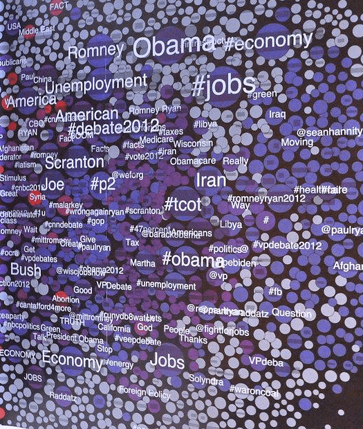

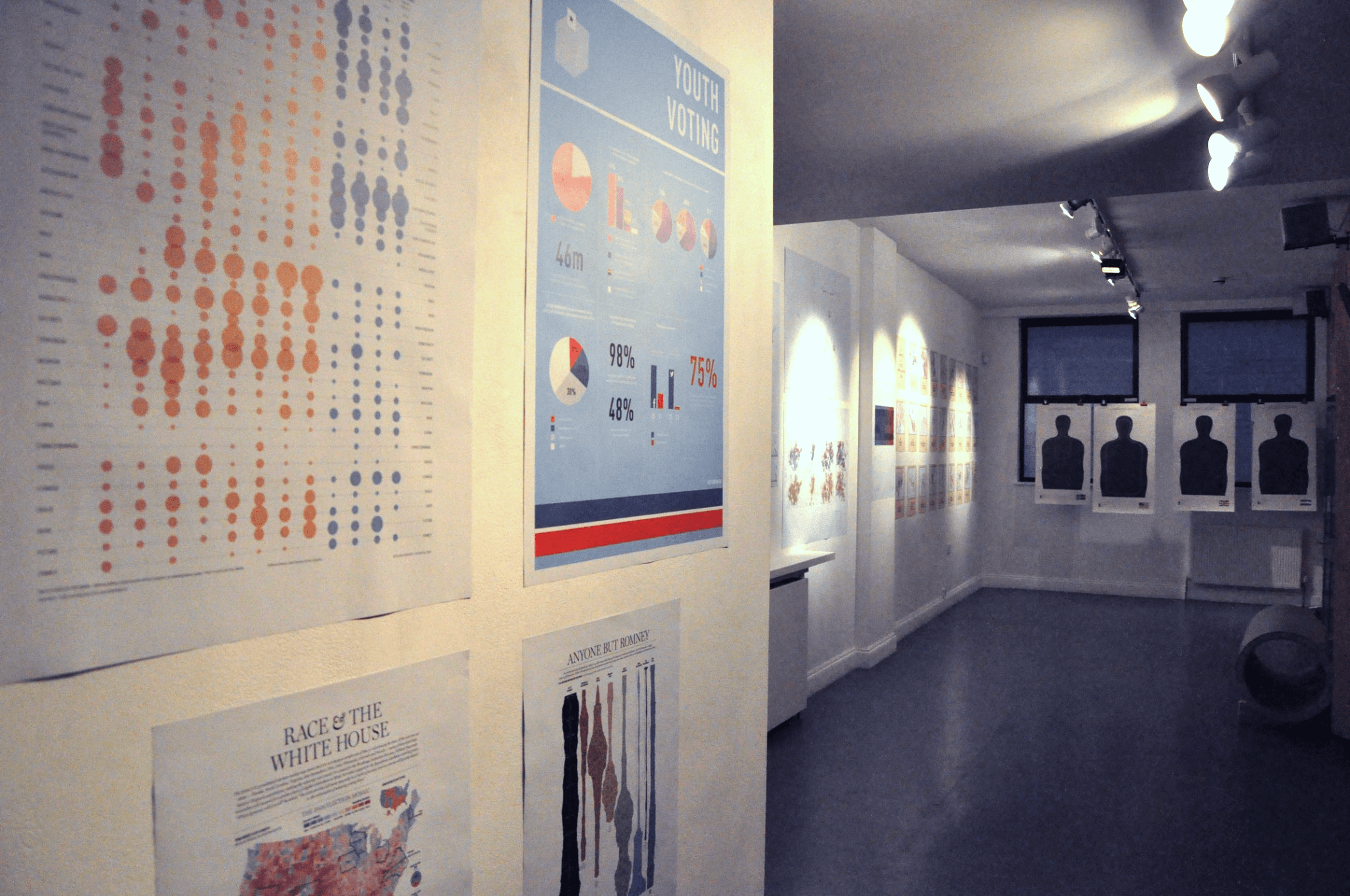
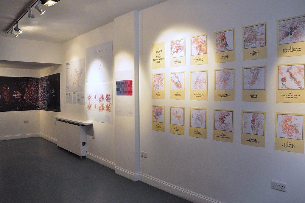
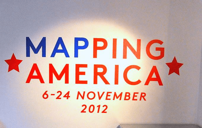

Mapping America Mapping America responded to the 2012 U.S. election by visualizing the deep divides shaping the American electorate. While much international coverage focused on Obama and Romney, the exhibition used infographics to reveal what lay beneath—race, religion, health care, unemployment, gun ownership, and more. Data was gathered in collaboration with students at MIT, then interpreted by infographic artists and academics from both sides of the Atlantic. The result offered a more nuanced view of American identity and geography, challenging the idea that the U.S. can be understood through its coasts alone.